Rebranding Brand Strategy & Creative Direction
Ankorstore is a French start-up wholesale online marketplace that connects independent retailers and brands.
Founded in July 2019, it attracted substantial investment and now works with 300,000 retailers and over 30,000 brands. Ankorstore needed to create a strategy and brand identity framework that would both raise its profile and support its future plans.
Approach
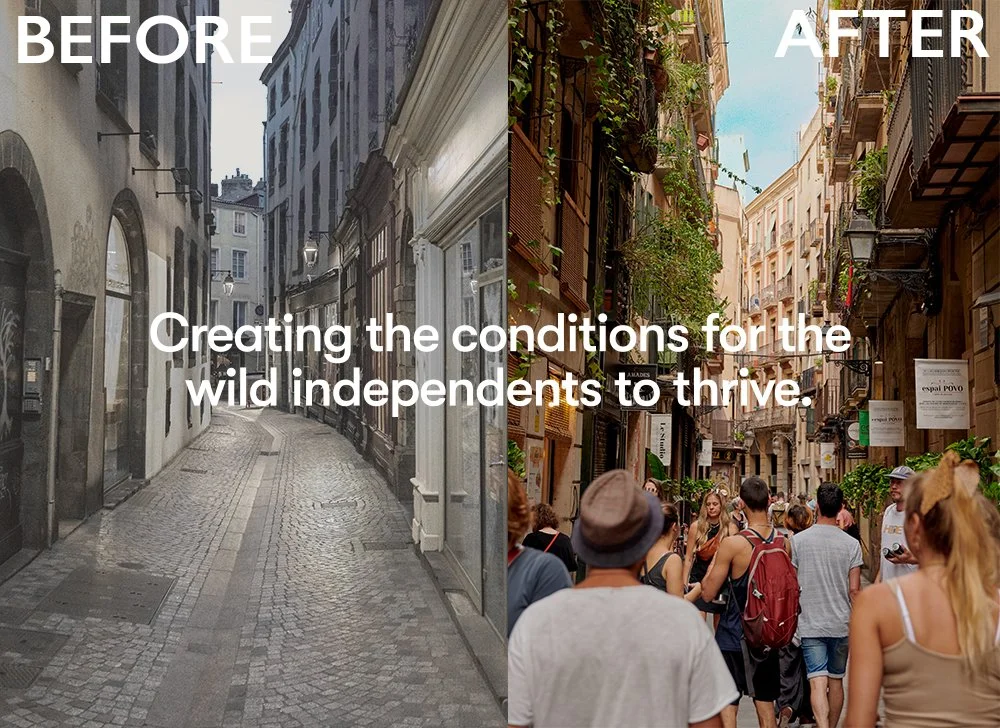
Ankorstore needed a foundational brand concept that would help people ‘get’ their purpose to exist: the system and mission. Like the "web" or the "cloud" concept, the approach was to give people a unique mind picture. We rewild retail. Creating the conditions for the wild independents to thrive.The strategy championed the idea of ‘rewilding retail’ by creating a mutually beneficial ecosystem where both retailers and brands thrive while remaining independent and staying competitive.

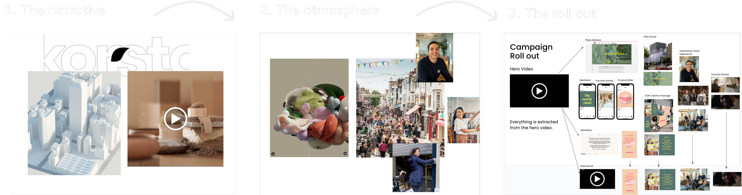
The Avareness Campaign Launch
Storytelling
The story spans out around a city that has been taken over by big e-commerce giants,with the idea to explain the concept of rewilding retail by Ankorstore. Taking the symbol of its logo - the leaf - hat gently falls, and as the seed that triggers an explosion of colour and diversity that would expand across the city, thus independent shops would be shaped.
as a result of the explosion we find streets full of retailers, shoppers and lively products, connecting, all elements of the new branding.
Concepting phase snap
VISUAL IDENTITY
Approach
After a difficult few years for retail, Ankorstore is putting the power back in the hands of the independents. the new brand identity will help it realise its vision to build a thriving ecosystem for retailers and brands and create a framework that will enable it to fulfill its ambitious plans for the future. The new visual style uses a flexible colour palette featuring a set of clean brights and pastels, which can be used in many different combinations. Typography is kinetic, bold and modern while remaining approachable, with Grilli Type’s geometric GT Walsheim used throughout.

This forms the basis of Ankorstore’s wordmark, which features a distinctive leaf-shaped letter ‘r’. This natural form is echoed in the Ankorstore symbol, which is used as Akorstore’s social media icon and represents many different elements coming together to form the growing ecosystem. It also acts as a unifying element that will work across Ankorstore’s planned brand extensions. The branding contain a library of eight different aperture shapes, reflecting its presence in the real and digital worlds. These act as portals into the world of Ankorstore. Used as graphic devices throughout the identity, these shapes help give a sense of depth to images and act as markers for category portals on the website. The 3D digital objects are the proposed disctinction elements for this branding, which emphasizes the digitial experience within the reality of retail creating thus the ‘augmented retail’ of Ankorstore ecosystem. Product photography plays a key part.Shots of shop owners are friendly and naturalistic, with interior shots showing beautifully curated but still welcoming spaces.